Case Study
School of American Thanatology
Cole Imperi founded the School of American Thanatology in 2020 during the global pandemic. The world was in dire need of death doulas with diverse backgrounds and better information on how to process loss—in and of life.
Cole quickly launched the school with the basics—a logo, a vision, a mission statement, etc. After the first school year was complete, she was ready to expand the visual identity so it could become an institution, separate from her.
Cole wanted the school to have a life of its own, one that lived on—long after she was gone.
Services: Brand Strategy, Brand Identity, Digital Design

The Challenge
The school was attracting its ideal audience, however, Cole’s personal Instagram account was doing all the work for recruiting. In a focus group, one student said, “I wasn’t sure about enrolling until I saw Cole’s green hair on instagram. As soon as I saw her, I knew this was a safe place for me.”
The Goal
Expand the visual identity to be a system that doesn’t have to rely on Cole’s personal IG account to validate that this is a warm, welcoming, safe place for non-traditional folks to start a career in deathwork.
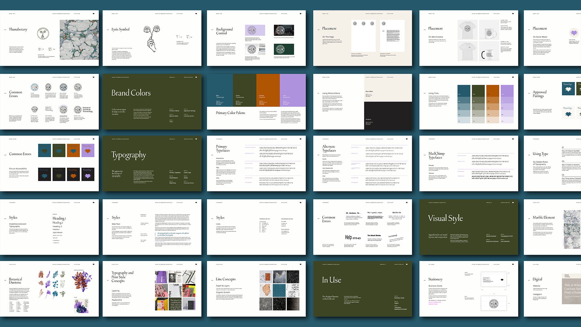

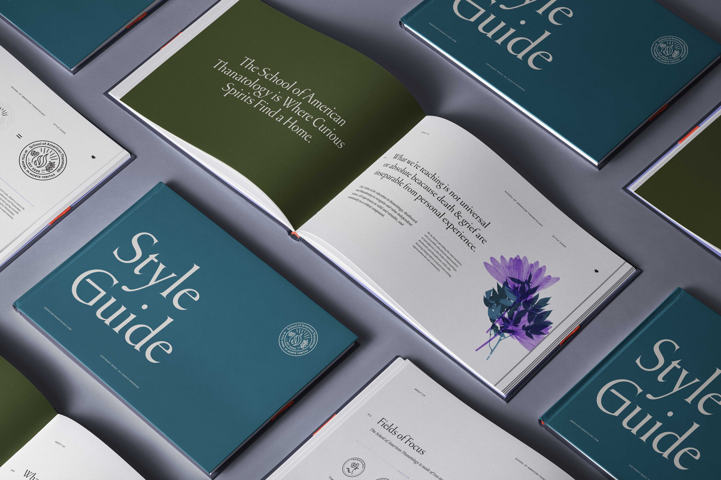
Typography
—
I could hardly believe it when I found a typeface that was inspired by stone-carved typography from gravestones. It just felt perfect, and Cole agreed. Cole studied typography at Cooper Union, and loved the idea of using Greenstone.
Greenstone and was designed by Connor Davenport of Sharp Type. It was designed based on numerous cemetery grounds in the American Northeast, observing carved lettering from headstones. Some of the capital letters were also inspired by plaques carved by Oscar Ogg for the US Maritime Commission during his time in Fredericksburg, Virginia.

Image from sharptype.com
Botanical Elements
—
Incorporating plants as a visual element was important since the school pioneered the study of Thanabotany. The challenge was how to incorporate them in a way that made sense for this brand and could be sustainable over time without getting old.

We found endless inspiration in the botanical scans from research libraries—roots and all. This made more sense instead of using stock photos of living plants. The overlapping effects became a fun, vibrant part of the identity that helped to remove any stuffy, cold academic vibes. From the scans, we built a library to play with.


You made it to the end! Thank you.
Did this get you thinking about your brand?
Consider booking a chat with Angela for a 1:1 assessment of your brand.